Getting Started Tutorial
Step-by-step tutorial for building your first dbt Charts dashboard from SQL.
Prerequisites Check
Before starting, ensure you have:
- ✅ dbt Charts installed (
dct --version; see Installation) - ✅ A database dbt Charts can query: Postgres, Snowflake, BigQuery, DuckDB, SQLite, or a local CSV/Parquet file
You do not need dbt to build dashboards. Most projects start with plain SQL, and dbt Charts queries dbt-modeled tables the same way.
Every example in this tutorial queries Dundersign, the fictional
document-signing company whose dataset ships with dbt Charts. To run them
against real data, download
examples.duckdb
(12 MB) from the dbt Charts repository and save it as data/examples.duckdb in
the project you set up in Step 1. Every complete board below (steps 4 and 7,
and the final example) then runs as-is; the in-between steps are the fragments
that build up to them. Swap in your own tables whenever you're ready.
Step 1: Set Up Project Structure
dbt Charts dashboards ("boards") live in a charts/ directory. A minimal project
is just that directory plus a dbt_charts.yml that names your data source:
my-project/
├── dbt_charts.yml            # Names your data source(s)
├── charts/                  # Your dashboards here
│   └── my_first_dashboard.yml
├── data/                     # Local databases
│   └── examples.duckdb       # Dundersign data, downloaded above
└── assets/                 # Optional: images, CSV data files
    ├── images/
    └── data/
Point dbt_charts.yml at a database. A local DuckDB file needs no credentials,
which makes it the quickest way to start, so this tutorial points at the
examples.duckdb you downloaded. path: takes any DuckDB file, so swap in your
own when you're ready:
# dbt_charts.yml
sources:
  db:
    type: duckdb
    path: ./data/examples.duckdb
The source name db is the convention this tutorial sticks to; it's also
what the bundled playground project names its demo warehouse source, which
is why the boards below run unchanged there.
See Sources for Postgres, Snowflake, BigQuery, and dbt profile connections.
Step 2: Create a Dashboard File
Create charts/my_first_dashboard.yml with a title and the source it reads from:
title: "Dundersign Overview"

source: db
The board-level source: applies to every query in the dashboard, so you don't
repeat it on each one.
Step 3: Define a Query
Add a SQL query that returns the columns you want to chart:
title: "Dundersign Overview"

source: db

queries:
  documents_by_status:
    sql: |
      SELECT
        status,
        COUNT(*) AS documents,
        ROUND(AVG(page_count), 1) AS avg_pages
      FROM dundersign.documents
      GROUP BY status
      ORDER BY documents DESC
The query owns the data: its grain, aggregation, and ordering. Each query has
a name (documents_by_status) and returns named columns (status,
documents, avg_pages) that charts bind to.
Step 4: Create a Chart
Add a chart that maps query columns to visual channels:
title: "Dundersign Overview"

source: db

queries:
  documents_by_status:
    sql: |
      SELECT
        status,
        COUNT(*) AS documents,
        ROUND(AVG(page_count), 1) AS avg_pages
      FROM dundersign.documents
      GROUP BY status
      ORDER BY documents DESC

charts:
  documents_chart:
    title: "Documents by Status"
    query: documents_by_status
    type: bar
    x: status
    y: documents
The chart doesn't aggregate or infer anything; the query already did that.
The chart only decides that status goes on the x-axis and documents on the
y-axis.
Step 5: Organize with Layouts
Layouts arrange your charts. Use rows to stack, cols to place side by side,
or grid for precise columns:
rows:
  - title: "Document Activity"
    cols:
      - documents_chart
      - revenue_chart
Step 6: Validate and Preview
Validate the dashboard:
Fix any errors it reports, then start a live preview:
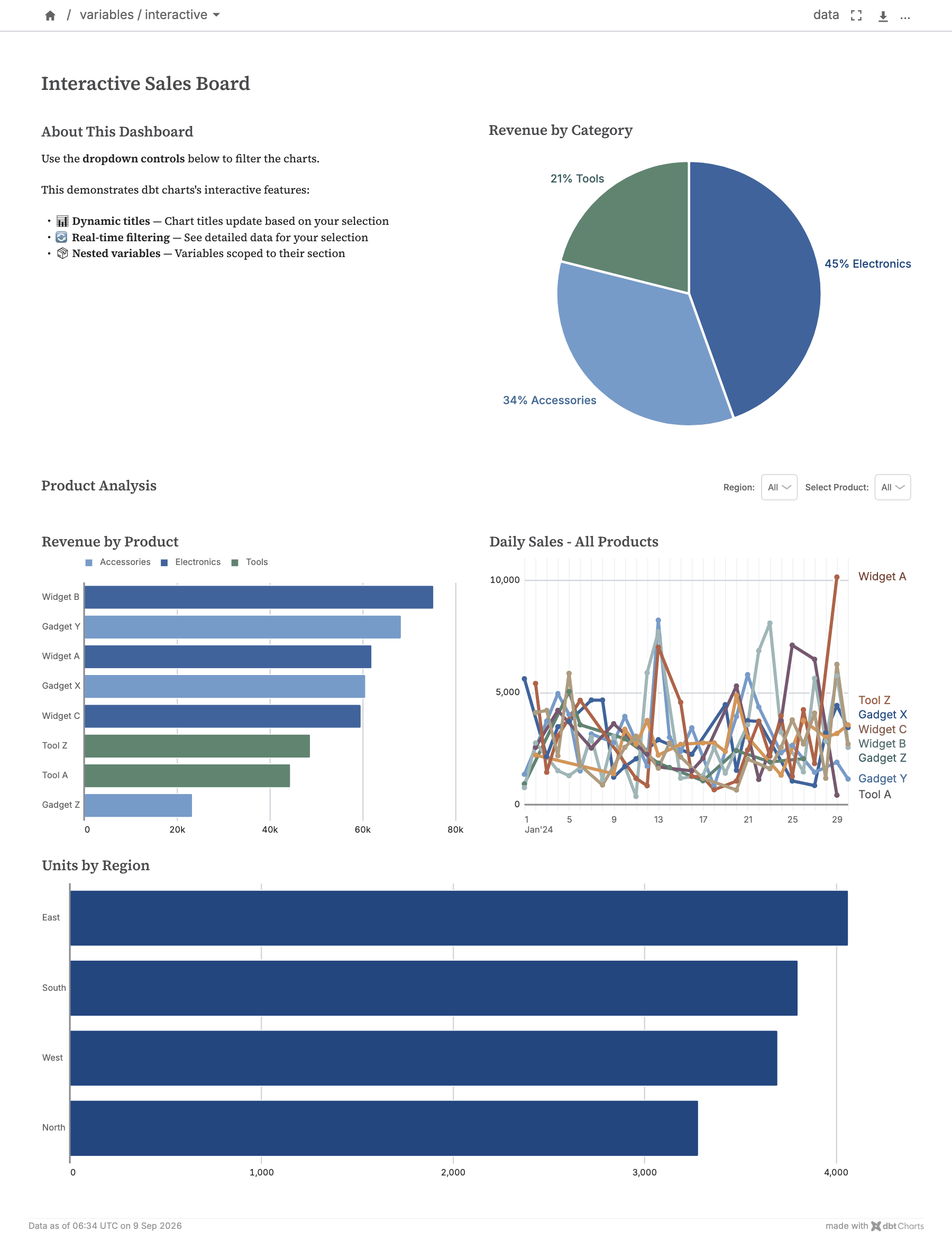
Open the URL dct serve prints on startup to see your dashboard. It re-renders
as you edit the YAML.
Step 7: Add Variables
Variables are the controls readers use to filter a dashboard. Wire one into the
query with the filter() helper; it writes the SQL predicate for the selected
value, or a no-op when nothing is selected:
title: "Dundersign Overview"

source: db

variables:
  status:
    input: select
    options:
      static: ["sent", "completed"]
    # No default: starts on All statuses

queries:
  documents_by_status:
    sql: |
      SELECT
        status,
        COUNT(*) AS documents,
        ROUND(AVG(page_count), 1) AS avg_pages
      FROM dundersign.documents
      WHERE {{ filter('status', status) }}
      GROUP BY status
      ORDER BY documents DESC

charts:
  documents_chart:
    title: "Documents by Status"
    query: documents_by_status
    type: bar
    x: status
    y: documents

rows:
  - title: "Document Activity"
    cols:
      - documents_chart
Now the status selector filters the chart. A variable never filters data on its own; you always wire it into a query explicitly.
Step 8: Add More Charts
Time-series charts want month grain, and that grain belongs to the data
layer, not the chart: Dundersign's dbt project pre-aggregates a
dundersign_serving.monthly_metrics rollup (one row per month), so the query
stays a plain SELECT; no date functions, and the same SQL runs on any
warehouse. The demo window opens and closes mid-month, so the query trims the
partial first and last months, the everyday trick for dropping in-progress
periods, again without any date math. Add the query, a second chart, and
place both in a grid:
queries:
  monthly:
    sql: |
      SELECT month, revenue, new_users
      FROM dundersign_serving.monthly_metrics
      WHERE month > (SELECT MIN(month) FROM dundersign_serving.monthly_metrics)
        AND month < (SELECT MAX(month) FROM dundersign_serving.monthly_metrics)
      ORDER BY month

charts:
  documents_chart:
    title: "Documents by Status"
    query: documents_by_status
    type: bar
    x: status
    y: documents

  revenue_chart:
    title: "Revenue by Month"
    query: monthly
    type: line
    x: month
    y: revenue

rows:
  - title: "Document Activity"
    grid:
      columns: 24
      items:
        - item: documents_chart
          width: 12
        - item: revenue_chart
          width: 12
Complete Example
Here's the full dashboard: the status filter, the status breakdown, and the monthly trend:
title: "Dundersign Overview"

source: db

variables:
  status:
    input: select
    options:
      static: ["sent", "completed"]
    # No default: starts on All statuses

queries:
  documents_by_status:
    sql: |
      SELECT
        status,
        COUNT(*) AS documents,
        ROUND(AVG(page_count), 1) AS avg_pages
      FROM dundersign.documents
      WHERE {{ filter('status', status) }}
      GROUP BY status
      ORDER BY documents DESC

  monthly:
    sql: |
      SELECT month, revenue, new_users
      FROM dundersign_serving.monthly_metrics
      WHERE month > (SELECT MIN(month) FROM dundersign_serving.monthly_metrics)
        AND month < (SELECT MAX(month) FROM dundersign_serving.monthly_metrics)
      ORDER BY month

charts:
  documents_chart:
    title: "Documents by Status"
    query: documents_by_status
    type: bar
    x: status
    y: documents

  revenue_chart:
    title: "Revenue by Month"
    query: monthly
    type: line
    x: month
    y: revenue

rows:
  - title: "Document Activity"
    grid:
      columns: 24
      items:
        - item: documents_chart
          width: 12
        - item: revenue_chart
          width: 12
Next Steps
Now that you've built your first dashboard:
- Read the Queries Guide: SQL, values, files, HTTP, and dbt models
- Read the Charts Guide: explore chart types and options
- Read the Variables Guide: add more interactive filters
- See Examples: explore complete dashboards
- Best Practices: dashboard design best practices
Common Questions
How do I know which tables and columns are available?
Use dct query against INFORMATION_SCHEMA to browse your source's tables
and columns without leaving the terminal:
Can I use multiple queries?
Yes; define multiple queries and reference them from different charts.
How do I add more rows?
Add more items to the rows array. Each row can have its own cols or grid.
Can I customize colors and styling?
Yes. See Themes for the built-in themes and custom ones, and Styling for everything else.
Related
- Installation Guide: installation and setup
- CLI Reference: complete CLI command reference
- Troubleshooting Guide: common issues and solutions
- Best Practices Guide: dashboard design best practices
- Queries Guide: query reference
- Charts Guide: chart reference
- Variables Guide: variables reference